The National Park Service's centennial logo is uninspiring.
National parks, it's held up, are "America's best idea," but logos chosen for the National Park Service to celebrate its centennial and to use in other venues fail to reflect that belief. Indeed, they ignore the rich heritage and beauty of the National Park System in a curious attempt to "engage and connect with new audiences."
With a landscape of more than 84 million acres containing such world-famous icons as Old Faithful, Half Dome, and the Grand Canyon, historic sites that trace the birth and evolution of the United States, and poignant settings that recall Americans' heroism, the creative possibilities to entice visitors of all ages into the National Park System and celebrate the Park Service's stewardship of these lands are many. Millennials, studies show, want to be entertained and educated with meaningful content, yet these evocative and inspiring images and themes are absent from the logos.
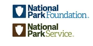
While individual units of the park system capture elements of their heritage in their own commemorative logos, the multi-million-dollar campaign to celebrate the Park Service's 100th birthday in 2016 took the agency's iconic arrowhead logo, stripped it bare, and colored it green.
Park Service officials, and those with Grey New York, which is handling the centennial campaign, offer that simpler is better when trying to connect the Millennial generation with national parks.
What's the message? What's the connection?
Ken Dowling, a partner at Grey, said earlier this year that new logos that put the Park Service and its charitable fund-raising arm, the National Park Foundation, on the same platform were designed to introduce Millennials to the parks.
'I don't think it's been on the Millennials' radar," Mr. Dowling told AdWeek. An interview request Friday was not granted.
A somewhat similar intent -- to reach audiences younger than Baby Boomers -- was voiced by Park Service spokeswoman April Slayton when asked what message the Centennial logo was striving to impart.
"The Centennial logo provides a fresh new look as we engage and connect with new audiences while celebrating this milestone," she wrote in an email. "The design, which incorporates the arrowhead shape, reflects the style of the new National Park Service logo that was announced earlier this year to accompany the traditional arrowhead in the NPS visual identity. Neither addition replaces the arrowhead. Instead, they provide the National Park Service and its partners with the flexibility to use the logo in circumstances where the arrowhead may not be appropriate."
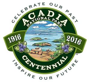
"Celebrate Our Past, Inspire Our Future"
But in reaching for a "fresh new look," the ad agency produced a bland, aseptic image that offers no tangible connection to the national parks. The logos spark no wonderment, inspire no exploration, and overlook why the parks are hailed as America's best idea. They fail to so much as hint at the incredible diversity, history, and awe of the American landscape contained within the park system.
At Rocky Mountain National Park, which marks its centennial in 2015, the official logo connects "Wilderness, Wildlife, Wonder" to the landscape with images of bighorn sheep, snow-clad mountains, and pine cones. A logo for Acadia National Park's centennial in 2016 not only urges us to "Celebrate Our Past, Inspire Our Future," but features a view from atop one of the park's granite-domed mountain trails with views out to Frenchman Bay.
Understandably, individual parks have limited focus around which to build their logos. The National Park System covers more than 400 units, and it wouldn't be realistic to try to capture all visages in one logo for the National Park Service.
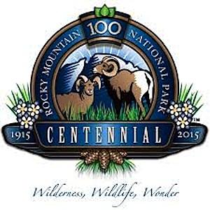
"Wilderness, Wildlife, Wonder"
But there is nothing in the Centennial logo that speaks either to the agency's first 100 years or looks forward to the next. And while Ms. Slayton said the two (very, very similar) shades of green in the logo "tie together the robust history of the National Park Service and the energy and excitement of the Centennial celebration," that connection is hard, if not impossible, to visualize.
While a centennial celebration is quickly over, and so the 2016 Centennial logo might be viewed as just a throw-away, the remaining logos Grey has left with the Park Service and Park Foundation go equally begging for explanation. They fail to connect with the parks, largely fail to distinguish the two entities from one another, and seem to be little more than a marketer's creation for licensing products.
Coca Cola admitted it made a mistake when it tried to replace the original recipe back in 1992 -- much to public rejection -- and it was deemed a marketing failure. It's not too late to develop a meaningful set of logos for the Park Service. The national parks, and the National Park Service, merit better.


Comments
Just finished Deep Creek trail from Newfound Gap down to Bryson City. Passed 5 backcountry sites and didn't see a single other person hiking or backpacking in the Smokies over the weekend in 17 miles of trail. So I don't see this surfeit of 20 somethings or anysomethings. And that is most every weekend I am backpacking.
Deep Creek? That's a second growth trail that is one of the most ho-hum trails in the park, except for the first mile and a half from the top of NFG. Of course you aren't going to see an average tourist on that one. Be realistic. LeConte, the Chimneys, the AT are filled with young fit people on a daily basis. When I lived in the west, young fit people on the trails! In moab? Young fit people in both parks along with tourists of all shapes and ages. In Yosemite? Young fit people on the rocks. In Glacier? Young fit people climbing the mountains. Come on. These social media sites that the parks run have a reach of over a million some people with each post, and the growth continues to expand. Once again, the people that rant on these pages, don't seem very engaged to what is going on or have a realistic view. Even the NPT facebook page has a lot more engagement than the comment section on this site.
d-2, respectfully, I think your information may be incorrect.
Nixon took office in January 1969. One of the first things he did was announce a huge effort to "modernize" the government. Part of that was the redesign and replacement of the logos of virtually every Federal agency. (And the "modernization" of the White House guards' uniforms.) The new badges, signs and all the other "modern" insignia appeared in late 1970.
I really, really do not believe that either Stewart Udall or George Hartzog had anything to do with that mess. Udall was replaced as Secretary as soon as Nixon took office. Hartzog was retained for awhile for political reasons that I don't really recall and don't have time to research right now. Again, as my memory remembers, Hartzog was forced to order removal of the Arrowheads from uniforms and buildings and signs.
Nixon's "modernization" efforts met with such backlash almost everywhere that they quitely died out not too much later. I don't think we wore those badges more than a few months. It was so apparent that "modernization" wasn't going to last that most of the old arrowhead signs that had been removed from VCs and other places were simply stored until they could be brought back to replace the Praying Hands and Triangles and Balls.
Do any other fossilized rangers remember this period in our history?
Hi Lee Dalton. You motivated me to go into the NPS-CR-Admin Histories files online to see what is there. The site seems to be going thru reconstruction, but eventually i was able to find this (READ BELOW) historical overview from the NPS admin history of the NPS. At the end i will place links, but remember you may have to look at the Cultural Resources programs CACHED copies, if NPS is going thru a transition on posting this stuff:
"In 1966, following MISSION 66, Director George B. Hartzog, Jr., came forth with a new agenda titled PARKSCAPE U.S.A. Hartzog assured employees that the symbol accompanying the program, three interlocking angles surrounding three dots, would supplement rather than supplant the arrowhead. In 1968, however, when Secretary Udall adopted the new Interior seal (designed by the same New York firm of Chermayeff and Geismar Associates), Hartzog seized the opportunity to replace the arrowhead with the Parkscape symbol. With the buffalo gone from the Interior seal, he rationalized, the arrowhead with its buffalo was no longer relevant. Field reaction to this move was nevertheless unenthusiastic, for the representational arrowhead was far better liked than the abstract Parkscape symbol.
On March 3, 1969, Acting Director Edward Hummel sent a memorandum to all regional directors ordering the removal of the arrowhead shoulder patch. "In keeping with the Director's desire to act positively on field suggestions, it has been decided that effective June 1, 1969, Service emblem shoulder and cap patches will not be worn on any National Park Service garments," he wrote. Before this unpopular directive could be implemented, Secretary Hickel reinstated the buffalo seal. Hartzog thereupon reinstated the arrowhead as the official NPS emblem and continued its use as a patch in a memorandum dated May 15, 1969. Perhaps as a gesture to the few supporters of the Parkscape symbol, he simultaneously ordered its retention as the official NPS tie tack. The arrowhead has continued to be worn on the uniform and to enjoy strong acceptance among Service employees. . . ."
Nixon was innaugurated in January 1969 and according to this official history above one of the first things they did was eliminate Udall's logo, and apparently pressured (or as my colleague maintained, the eruption among park rangers pressured) George Hartzog to back off. My memory of the people sent by the Nixon white house to pressure the NPS is that, surprisingly, the main one was not a communications person, but an Assistant Director of Strategic Planning, who was trying to plan the next hundred years but was done in, the story goes, by Hartzog's hatchett man, Len Norwood. Hartzog remained until Assist Sec. Nat Reed made it his business to push Hartzog out and bring in the man he said was "the best superintendent in the NPS" Director Everhardt. Harzog says he forced them to fire him to maximize his pension, while the Washington Post says Nixon and Haldemann demanded all Presidential appointees submit their resignation at the beginning of the second Nixon term. Maybe all three stories are true.
Here are those links in NPS histor website reconstruction:
http://webcache.googleusercontent.com/search?q=cache:http://www.cr.nps.gov/history/online_books/workman1/vol1e.htm
http://www.nps.gov/history/history/online_books/workman1/vol1e.htm
Very, very interesting, D-2. Thank you.
So just as today when everything is Obama's fault, back then it was easy to blame everything on Nixon.
Nothing much ever changes, does it?
And thank you for posting those links. i was not aware those sites existed.
OOPS: correction: Nixon installed Ron Walker, his WH advance man, after George Hartzog was fired. Not Gary Everhardt. Walker was widely ridiculed within the NPS, partly because the Media's take on Walker was, because he handled travel for the White House, Haldemann guessed that was what parks were all about, so why not install their loyal advance man as Director? Leading to persistent, and ultimately self-defeating, calls for a legislative fix to require NPS Directors to be park or preservation professionals. Kennedy, Mainella and Bomar all qualified using that standard, so go figure.
Gary Everhardt came in under Ford and A/S Nat Reed, but I swear i remember a guy walkin in after just leaving Reed's office, telling me Reed just told him Everhardt was "the best superintendent" an Reed thought he could work better with Gary than George. Reed had big dreams as did Hartzog. Anyway, Nixon was largely anti-environment, but he had Russell Train at CEQ in the White House, and the Asst Sec Reed and his two deputies were all Train people and strong environmentalists. Hickel, builder of the infamous 'Hickel Highway' in Alaska was no environmentalist, but Nixon really regretted hiring him because he would not do what he was told, and was headstrong in the extreme. When Hickel opposed the shooting of students at Kent State opposing Viet Nam war, Hickel was fired. The point is: the strong environmental Republicans at Interior did not share Nixon's philosophy; instead they reflected the long standing tradition in the Republican party that helped develop and foster environmental agencies and laws.
Nixon unlike the DOI Republicans at the time, was a cynic on environment, and saw it AT BEST as a device to get American youth distracted away from anti-Vietnam protests which he saw as treason, and focused instead on domestic reforms, that Nixon might not have liked much but saw as a way of bending and diverting youth inward toward comparative moderation.
Phew, d-2, there is a strong, almost nauseating foul smell of politics wafting from my computer.
It matters not who is President, nor who might be the NPS director, the ugliness of power politics prevails and pervades almost everything not only in the NPS, but everywhere else in government.
Thank you for taking the time and making the effort to share all this with us. This is the kind of thing Americans need to see instead of the lipsticked pigs that are paraded before us by our "leaders" of every party and every special interest.
Trouble is that Monday Night Football or the latest celebrity reality TV show is much more interesting.