The National Park Service's centennial logo is uninspiring.
National parks, it's held up, are "America's best idea," but logos chosen for the National Park Service to celebrate its centennial and to use in other venues fail to reflect that belief. Indeed, they ignore the rich heritage and beauty of the National Park System in a curious attempt to "engage and connect with new audiences."
With a landscape of more than 84 million acres containing such world-famous icons as Old Faithful, Half Dome, and the Grand Canyon, historic sites that trace the birth and evolution of the United States, and poignant settings that recall Americans' heroism, the creative possibilities to entice visitors of all ages into the National Park System and celebrate the Park Service's stewardship of these lands are many. Millennials, studies show, want to be entertained and educated with meaningful content, yet these evocative and inspiring images and themes are absent from the logos.
While individual units of the park system capture elements of their heritage in their own commemorative logos, the multi-million-dollar campaign to celebrate the Park Service's 100th birthday in 2016 took the agency's iconic arrowhead logo, stripped it bare, and colored it green.
Park Service officials, and those with Grey New York, which is handling the centennial campaign, offer that simpler is better when trying to connect the Millennial generation with national parks.
What's the message? What's the connection?
Ken Dowling, a partner at Grey, said earlier this year that new logos that put the Park Service and its charitable fund-raising arm, the National Park Foundation, on the same platform were designed to introduce Millennials to the parks.
'I don't think it's been on the Millennials' radar," Mr. Dowling told AdWeek. An interview request Friday was not granted.
A somewhat similar intent -- to reach audiences younger than Baby Boomers -- was voiced by Park Service spokeswoman April Slayton when asked what message the Centennial logo was striving to impart.
"The Centennial logo provides a fresh new look as we engage and connect with new audiences while celebrating this milestone," she wrote in an email. "The design, which incorporates the arrowhead shape, reflects the style of the new National Park Service logo that was announced earlier this year to accompany the traditional arrowhead in the NPS visual identity. Neither addition replaces the arrowhead. Instead, they provide the National Park Service and its partners with the flexibility to use the logo in circumstances where the arrowhead may not be appropriate."
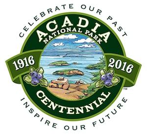
"Celebrate Our Past, Inspire Our Future"
But in reaching for a "fresh new look," the ad agency produced a bland, aseptic image that offers no tangible connection to the national parks. The logos spark no wonderment, inspire no exploration, and overlook why the parks are hailed as America's best idea. They fail to so much as hint at the incredible diversity, history, and awe of the American landscape contained within the park system.
At Rocky Mountain National Park, which marks its centennial in 2015, the official logo connects "Wilderness, Wildlife, Wonder" to the landscape with images of bighorn sheep, snow-clad mountains, and pine cones. A logo for Acadia National Park's centennial in 2016 not only urges us to "Celebrate Our Past, Inspire Our Future," but features a view from atop one of the park's granite-domed mountain trails with views out to Frenchman Bay.
Understandably, individual parks have limited focus around which to build their logos. The National Park System covers more than 400 units, and it wouldn't be realistic to try to capture all visages in one logo for the National Park Service.
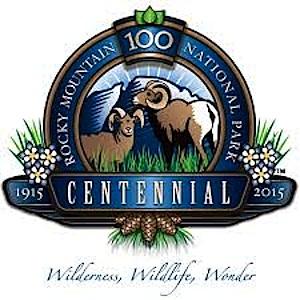
"Wilderness, Wildlife, Wonder"
But there is nothing in the Centennial logo that speaks either to the agency's first 100 years or looks forward to the next. And while Ms. Slayton said the two (very, very similar) shades of green in the logo "tie together the robust history of the National Park Service and the energy and excitement of the Centennial celebration," that connection is hard, if not impossible, to visualize.
While a centennial celebration is quickly over, and so the 2016 Centennial logo might be viewed as just a throw-away, the remaining logos Grey has left with the Park Service and Park Foundation go equally begging for explanation. They fail to connect with the parks, largely fail to distinguish the two entities from one another, and seem to be little more than a marketer's creation for licensing products.
Coca Cola admitted it made a mistake when it tried to replace the original recipe back in 1992 -- much to public rejection -- and it was deemed a marketing failure. It's not too late to develop a meaningful set of logos for the Park Service. The national parks, and the National Park Service, merit better.


Comments
Hmmm. Mundsy and d-2, you have certainly given us (or me, at least) some real food for thought. Thank you.
While reading d-2's comments, I thought of my youngest grand-daughters. 2, 5, and 8 who are bonded to electronic technology. Even the youngest simply blows me away when she gets busy with one of her parents' machines.
Maybe one solution might be to make cell phones that smell like pine cones . . . .
But thanks, both of you, for taking the time and effort to provide some comments that really add some new and thoughtful input into a place where perhaps too many of the comments come from a few entrenched old coots and young rebels who tend to think that our ways are the only ways -- SO THERE!
Agreed, Lee. It felt really good just to read insightful and constructive commentary.
d-2, a question.
I was in Yosemite and later in Greenbelt Park, Maryland when the arrowhead / praying hands controversy was raging. My recollection from then was that it was Nixon who was pushing for the changes. Could it have been that Hartzog's public position (whatever it was), was forced by political pressure from the White House? Remember, it was not too long after this and a few other conflicts between Nixon's administration and George B. that Hartzog was dismissed.
I'm not trying to argue here -- just asking.
And I'm curious. You sound as if you really know what you're writing about. Can you clue us in to what your background is and where your knowledge comes from? Is it firsthand?
Hi Lee Dalton -- my information is second hand. I joined right after the fight happened, and worked with a famous interpreter/trainer who once had been favored by Hartzog, but then as happened often with Hartzog he was dropped flat. Anyway, this colleague was still gloating over what he said was beating Hartzog over the logo issue. And, he seemed to have lots of buds from all around the System who all were plotting and fighting for the Arrowhead. I suppose it is possible bias distored his view, he had a reason to blame Hartzog it actually it was Stewart Udall alone. But his belief in the role of Hartzog still has me convinced, but i did not experience it personally.
All this happened before the Nixon election i believe.
The same guy who designed the NBC peacock logo designed the two for Udall and Hartzog. It was so typical of both men, who really thought just like so much of the Kennedy-Johnson era, that they were moving into a new age. Part of it was the idea that Interior would also take over the Forest Service, and become the Department of Natural Resources. That idea did last through the Nixon Admn, and was promoted by Secretary Morton in the 1970s. But Hartzog went too far, after Udall left, to direct rangers to remove the arrowhead from the uniform. The outrage was so great the decision was reversed before it was implemented, and Nixon's Sec Hickel did the same thing with the DOI symbol. But they made some spectacular park designs; I still have a copy of the poster for what is now Little Bighorn, showing a very artful freehanded sketch of a confused Custer and in the corner is the modern, now abandoned, logo.
As far as technology is concerned, ever since Freeman Tilden the NPS has believed in meeting the visitor on her/his own terms, or 'where the visitor is.' I don't believe Tilden would object to any communications, as long as it did not interfer with the park experience of others. The other thing, of course is: parks are about PLACE. The experience of PLACE. The line is when the technology helps the experience of place, and the line is crossed when the technology replaces or obscures authentic places.
Young advocates of technology understand all this, and make fun of geeks unable to emerge from their screens. Lee, just as your generation could laugh about the visitor who experienced the park through the lense of an SLR camera. But you didn't tell the person they could not bring in their camera. You trusted the power of the place to eventually bring many or even most people around. As long as it does not obstruct the experience of the place by other visitors, you let people grow at their own pace. Most learn. Some never do.
I think Mundsy is largely right about the logo not being the main thing with a lot of the new media. And graphics on highway signs become less important as more people rely on GPS. But on the other hand even on the new media, corporations are extremely concerned about a strong consistent "look" to their site with high quality design. And, many tourists today, much more than even in the past, like to buy things from the places they visit. And, there are multiple audiences, with different needs and communications expectations. Smokiesbackpacker takes it to such an unlikely extreme it ignores the fact that a such an event WILL require materials and messages, and those messages WILL have some kind of design concept. Donors and funding sources NEED to receive proposal packages, and those packages NEED to have disciplined consistent design with a clear identity. Any large awareness campaign NEEDS to connect a visual identity with the awareness campaign. Ask Apple. Even if they had figured out a way to use the Arrowhead with no design mods, they STILL would need something, anything, distinctive TO THE CENTENNIAL to Americans and other visitors get a heightened awareness of the opportunity of the Centennial and the meaning of the Centennial (in the sense that Dr. Runte spoke of collective achievement).
Thinking or saying that a campaign is motivated by personal benefit, by money from lobbying jobs is so vacuous and naive it makes me want to ask this question: "how would you spell 'oblivious'?"
The NPS has the copyright to "The" Arrowhead. Do they hold the copyright to the new logo(s)?
Mike
An excellent discussion. Thanks for all to take time to contribute.
I've really enjoyed reading the comments and find myself agreeing, in part, with everything I've read. Aack! Does this make me wishy-washy? I agree wtih Kurt in that the logos are bland and they personally don't really "float my boat". However, after trying to design my own photography logo and get it (unsuccessfully) embroidered on hats, I see the logic of keeping something simple for use with multiple media formats. I agree that smartphones,tablets, etc. are here to stay - even within the national parks - utilized by savvy (and maybe even not-so-savvy) people, young and old. To that end, I find that attention (well, at least *my* attention when looking at something on my iPhone) is grabbed with the use of brighter colors that make a bolder statement than the bland ones used in the NPS logos.
Again, great, insightful commentary - I've enjoyed reading everybody's weigh-in.
The funny thing is those that are using social media to get a daily view from the parks are getting those images from higher end SLR's and cameras that exceed what can be done on a cell phone. Plus, for the few on here saying that the NPS isn't engaging technology, I disagree. Almost all parks are on social media. Many parks have cell phone tours that is if they are in a park that has good cell phone access. So, other than putting cell phone towers all over the place, so people can play their cloud games in the woods, I don't see what others claim to be seeing. It's only a matter of a small era before satellite phone are all over the place, so why jeopardize the woods for more towers, when at best cell towers are 20 year outposts that will eventually get torn down?
Also, i've encountered my fair share of kids under 20 in the woods this summer season. I'm not sure where people are getting their stats, but it's not close to what i'm seeing in real time.