The evolution of NPS emblems/NPS
Editor's note: To provide some added perspective to emblems used by the National Park Service to go along with our viewpoint on the agency's centennial logo, we went into the Traveler archives to locate this article Bob Janiskee wrote six years ago on the birthday of the traditional arrowhead symbol that is the Park Service's official emblem.
Like the familiar 'Smokey the Bear' Stetson ranger hat, which was formally adopted nearly 90 years ago, the Park Service arrowhead emblem has become an American icon. The story behind the Arrowhead is quite interesting. We'll try to cover the basics here and throw in a little trivia for fun.
If you want to research the details, there is an excellent compendium of information on the origin and evolution of the Arrowhead at this site.
We hasten to point out that the Arrowhead photo accompanying this article is in the public domain from the copyright standpoint. Other restrictions apply, however, and using the Arrowhead for unauthorized purposes can trigger legal sanctions. Title 36 Code of Federal Regulations 11.1-4 spells out the relevant definitions, uses, powers to revoke uses, and penalties for wrongful use of the Arrowhead.
Although we refer to 'the' Arrowhead, a few different renderings (explained below) are in use today. For a 'representational illustration of the developmental progression of today's Arrowhead patch, see this site.
The Park Service's Arrowhead is rooted in the heraldic tradition of family crests and coats of arms emblazoned on shields and banners to proclaim status, declare affiliations, help distinguish friend from foe, and adorn the walls of banquet halls. Each element of the design is supposed to symbolize something significant (though medieval coats of arms were often just pretty designs adding up to gibberish).
The essential elements of the Arrowhead are the Sequoia tree, the bison, the mountains and water, and the overall shape of the emblem.
As the FAQs section of the National Park Service home page explains, the Sequoia tree and the bison represent vegetation and wildlife, the mountains and water represent scenic and recreational values, and the arrowhead shape of the emblem represents historical and archaeological values.
The bison actually does double duty. It's also the dominant symbol on the Department of the Interior seal.
Variants of the basic Arrowhead have been created at different times for different purposes. One version of the Arrowhead, for example, is designed to look as though it were carved in wood or stone.
The familiar version with the dark brown background (see the accompanying photo) is used as a patch or decal for the ranger uniform. The arrowhead emblem has been used on ranger hats, caps, and other headwear since 1964.
If you are a Volunteers in Parks (V.I.P) volunteer, your uniform's patch (variously sewn on shirt/jacket shoulder, vest, breast pocket, cap, etc.) has VOLUNTEER stitched in white above the arrowhead. Master Volunteer Rangers and Presidential Volunteer Rangers have their own distinctive patches.
Emblem Development
The Arrowhead emblem has an interesting ' and tangled -- evolution. It begins with the emergence of park rangers as a corps of professionals who wanted their uniforms and insignia to make a unique statement.
The first 'official' ranger uniforms were authorized in 1911. This was a time when US Army cavalry troops were still patrolling some of the western parks and there was no large, formally organized civilian ranger corps as we have today. After the National Park Service came into existence in 1916, uniform and insignia design continued to convey a military approach to organization.
After a good deal of experimentation, the 'officers and men' mentality waned and ranger uniforms lost most of their military trappings. The uniform that rangers wear today is in many ways similar to that worn in 1920.
By 1928 there was a standardized approach to designing uniforms and insignia for rangers and administrators. This meant that, at least in terms of uniform design, rangers in the field were raised to the same level as administrators 80 years ago.
Ranger uniforms varied with job description and geographic area. For example, motorcycle rangers had a distinctive uniform. A photo depicting 1930s-era uniform designs can be seen at this site.
There was strong feeling that the Park Service should have a distinctive emblem. The agitation was partly attributable to the fact that the U.S. Forest Service, an agency that was regarded as a competitor for many practical purposes, already had its shield emblem.
The Sequoia cone was used as an emblem for a while, but many grumbled that it did not adequately symbolize the National Park Service. By the late 1940s, the agency had gotten serious about adopting a more appropriate emblem.
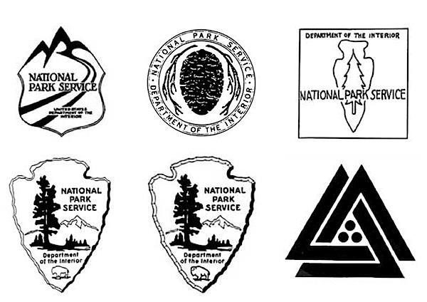
An emblem contest held in 1949 resulted in the selection of Dudley Bayliss' 'road badge' design (top row, far left above). Though Bayliss collected his $50 prize, the road badge was never used. Ultimately, it was deemed too formal and modernistic -- or if you prefer, too far from nature and rustic experience. What was needed was something that would more appropriately symbolize what the national parks were all about.
A watershed event occurred shortly after the contest was over when Aubrey V. Neasham, a historian in Region IV (now the Western Region) sent a letter to then-Director Newton Drury suggesting that an emblem 'like an arrowhead, or a tree, or a buffalo' would better symbolize the primary function of the Park Service. Neasham included a rough sketch of a design (top row, far right above) that incorporated a pine tree against the background of an elongated arrowhead
Drury praised the design's simplicity, a very important consideration, and felt that it got the job done as far as basic symbolism was concerned. However, he did not adopt and implement Neasham's ideas. When Drury resigned in 1951 (largely because of the Interior Secretary's failure to vigorously defend the parks against dam construction), the agency still did not have its official emblem.
Conrad L. Wirth replaced Drury as Director in 1951, and it was 'Connie' Wirth who finally got the ball rolling again by ordering Region IV (headquartered in San Francisco) to come up with an emblem that incorporated the key elements of Neasham's design.
Working under the direction of Region IV assistant director Herbert Maier, a team that included Sanford "Red" Hill, Cecil J. Doty, and Walter Rivers produced the agency's iconic arrowhead design (bottom row, far left above). Ignoring minor tweaking, and some very strong attempts in the 1960s to completely replace it, that design (bottom row, middle above) is still in use today.
On July 20, 1951, Secretary of the Interior Oscar L. Chapman, authorized the National Park Service arrowhead emblem.
A July 29, 1952, amendment to the National Park Service 1947 uniform regulations ordered the use of the arrowhead emblem as a patch for the uniform. Each permanent uniformed employee was given three patches and each seasonal uniformed employee received one. Although employees at first hated wearing the arrowhead patch, they soon grew to like it.
The year 1952 also witnessed the first use of the arrowhead emblem on park signs and publications.
There was concern that the Park Service arrowhead emblem would be used for 'unseemly' commercial purposes, so an official notice was published in the Federal Register of March 15, 1962 (27 F.R. 2486). While this action proclaimed the Arrowhead as the official symbol of the National Park Service, it had already been the de facto official symbol for a decade.
An additional layer of protection was added on February 9, 1965, when the arrowhead emblem was registered with the U.S. Patent Office as the official emblem of the National Park Service.
Traveler footnote: The emblem on the bottom row, far right, above, was designed during George Hartzog, Jr.'s tenure as Park Service director. The design, which Hartzog thought should replace the arrowhead design, featured three triangles that were said to represent the outdoors (trees and mountains), enclosing three balls, which were the standard symbol for preservation.


Comments
Bob, are you sure George Hartzog wanted the triangles and cannon balls. As I remember it, it was Richard Nixon who wanted to "modernize" the entire government. Part of that campaign was to redesign the emblems of virtually all Federal agencies. I was under the impression that Hartzog tried hard to kill the triangles. In any event, down in the ranks, there was almost open rebellion. This emblem and the accompanying redesign of the Interior Department's emblem died a painful death not too long afterward.
I was really amused about fifteen years ago when I visited Navajo National Monument and noticed the cannon balls and triangles pasted on their recycling cans. I asked at the VC and learned that someone had found the emblem in some old files and thought they were an old version of the current recycle image found today on those blue garbage cans. Those young puppies had never heard of Nixon's follies and thought the whole story was a real hoot.
At the same time, Nixon tried to "modernize" the unforms of the guards at the White House. They looked like something out of a Gilbert and Sullivan musical. There was nearly an explosion at the White House. That didn't last very long either.
It's interesting to note that in 1968-69, the seal for the Dept. of the Interior also had a brief change to a "modern" design that is somewhat similar to the interlocking triangles shown above for the NPS. According to this history of the Department, that revised design represented "a stylized pair of hands framing symbols of the sun, mountains, and water was adopted to represent the department's diverse responsibilities.....[but] the modern abstraction (by a New York design firm) assaulted sentiment and tradition."
As a result, there was a return to the more "traditional" seal that's in use today.
Right, Jim. That emblem was emblazoned on our badges for a short time.